|
|
Post by edwardsutorik on Apr 8, 2020 12:07:19 GMT -8
I was lyin' in bed last night, and I got to thinkin' about one of my favorite locomotive paint schemes: BN (the common version)
Now, it's not Lightning Stripe, and it's not Daylight, and it's not Loewy, and it's not Warbonnet.....
It's, as I said "non-flashy".
And I thought more about it: The top of the loco is black. That means it can get sooty dirty and not show--kinda tough for the lighter colors. The green is middling bright, strong enough to be noticed, but not vibrating. And I really liked the graphics. The NUMBERS were huge, and you could see them a long ways away. Great for when you're studying photos from the olden days, and also great if you're in a yard tower and looking "over there". The company logo, however, is comparatively small. While they made it huge on rolling stock, it was small on locos. But rolling stock goes all over the country, while locos stay online. And everyone online already knows who owns the loco, so there's no need to yell it out. I even like the white diagonal stripes. They add, for me, just the right amount of business at the ends. And, if one were to care, they denote the front of the loco. If there's stripes on BOTH end, there's two fronts. Well, two control stands.
I invite others to post and comment on the matter of non-flashy schemes.
I'll mention that the SP bloody-nose has always worked for me. And, not stopping, I like PC, which is about as non-flashy as you can be and still be alive. It's the logo, of course. And Pennsy. Not the 5-stripe (which is actually flashy, in an understated way), by the late one: all dark green with those little heralds stuck all over.
Ed
|
|
|
|
Post by SOMECALLMETIM on Apr 8, 2020 12:24:45 GMT -8
Too easy. The late Mopac Jenk’s blue scheme. Dip locomotive in Jenk’s blue and then apply 4 1/2” Scotchlite nose chevrons and side sill stripe add 20” Scotchlite road numbers and then apply the Screaming Eagle buzzsaw Mopac decal under the cab windows and you’re complete with my favorite non-flashy paint scheme.
|
|
|
|
Post by edgecrusher on Apr 8, 2020 12:45:04 GMT -8
I've always like the look of the Erie diesels. Black with the yellow winged diamond, super sharp. Black always seems to look good on a locomotive.
|
|
|
|
Post by drsvelte on Apr 8, 2020 13:45:05 GMT -8
I've always like the look of the Erie diesels. Black with the yellow winged diamond, super sharp. Black always seems to look good on a locomotive. I would also add the early Erie-Lackwanna black and yellow. The C-424s look all business...  |
|
|
|
Post by edwardsutorik on Apr 8, 2020 14:48:58 GMT -8
I agree about the MOP.
I, also, do like the Erie and that EL, though they're ever so slightly almost sort of flashy. Somewhat. Still, very nice.
Ed
|
|
|
|
Post by drsvelte on Apr 8, 2020 16:05:08 GMT -8
I agree about the MOP. I, also, do like the Erie and that EL, though they're ever so slightly almost sort of flashy. Somewhat. Still, very nice. Ed The Clinchfield was never much into flash until the Family Lines era. 3600hp in black and yellow....  |
|
|
|
Post by theengineshed on Apr 8, 2020 16:34:03 GMT -8
Those Yellow number boards were certainly flashy!
|
|
|
|
Post by drsvelte on Apr 8, 2020 17:41:23 GMT -8
Those Yellow number boards were certainly flashy! I always thought they looked not so much flashy as a bit jaundiced!  |
|
|
|
Post by Paul Cutler III on Apr 8, 2020 19:29:25 GMT -8
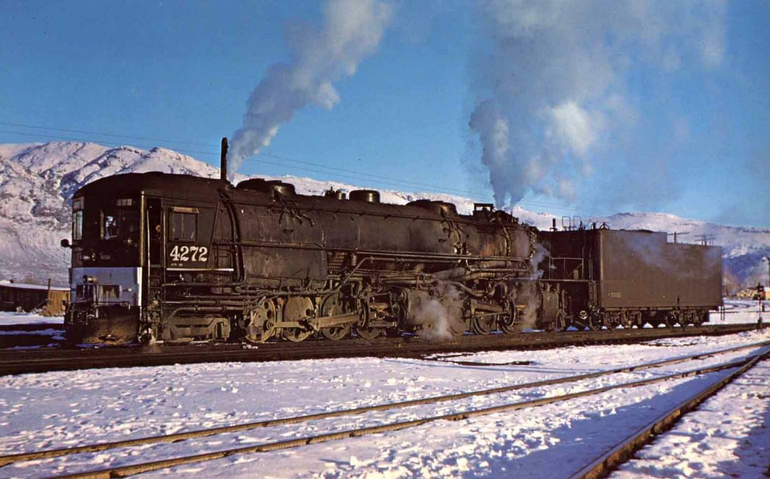
In the 1920's, the NH went from the gold leaf "NYNH&H" tender lettering and pin striping on domes, cab sides, and around the tender to absolutely nothing. It is called the "blank tank" era. The engines only had the road number in yellow on the sides of the cabs and on the tender rear along with a small "NH" (plus the road numbers on the head/rear lights). There was literally nothing on the tender sides but black paint.
I challenge anyone to find another official paint scheme for any Class I railroad had no railroad name, initials, herald, or logo on the side of their locos. And this wasn't just done to a few NH locos, this was pretty much all of them for almost a decade.
|
|
|
|
Post by edwardsutorik on Apr 8, 2020 20:04:02 GMT -8
I challenge anyone to find another official paint scheme for any Class I railroad had no railroad name, initials, herald, or logo on the side of their locos.  Ed |
|
|
|
Post by Paul Cutler III on Apr 8, 2020 20:08:53 GMT -8
And there you go!  Was that a one-off, or common on SP cab forwards? |
|
|
|
Post by brakie on Apr 9, 2020 1:38:09 GMT -8
To my mind this is as dull scheme.  |
|
|
|
Post by jonklein611 on Apr 9, 2020 4:12:03 GMT -8
Old school: Montour RR
New School: Alaska, but I'm not sure if it's considered "Simple"
|
|
|
|
Post by edwardsutorik on Apr 9, 2020 6:38:36 GMT -8
And there you go!  Was that a one-off, or common on SP cab forwards? I'm not an official SP guy, but living in the neighborhood, it's hard to ignore. I believe that the cab forwards running north of Sacramento had this feature, in their later years. Or is that "un-feature"? As I mentioned in my comments about the BN scheme, everyone knew what railroad they were looking at when they saw a cab forward. I had a fit and decided to buy one of the late Intermountains, and had to decide whether I wanted one with or without. That's where I learned about this. I chose a without, since that's what was on the locos that ran closer to my locale of interest. Ed |
|
|
|
Post by TBird1958 on Apr 9, 2020 7:54:44 GMT -8
I really like Rio Grande's "Switcher" colors the best, the small herald and diagonal orange stripes work nicely on EMD hood units - My fave on a GP30! It's very business like, note the battery access door have been reversed on the short hood, this was common in the '60s This photo is by our forum member Bob Danner (Nebraska Zephyr) from 1968 in Denver, CO.  |
|
|
|
Post by riogrande on Apr 9, 2020 7:59:25 GMT -8
And a nice photo it is! In one of my Rio Grande in Color books, the caption notes that the access door was often put in up-side-down as a shop prank or prank and was seen like that often.
If Athearn or ScaleTrains ever get around to doing a high fidelity D&RGW GP30, I'll be tickeled and my wallet will be very afraid.
|
|
|
|
Post by dti406 on Apr 9, 2020 8:07:03 GMT -8
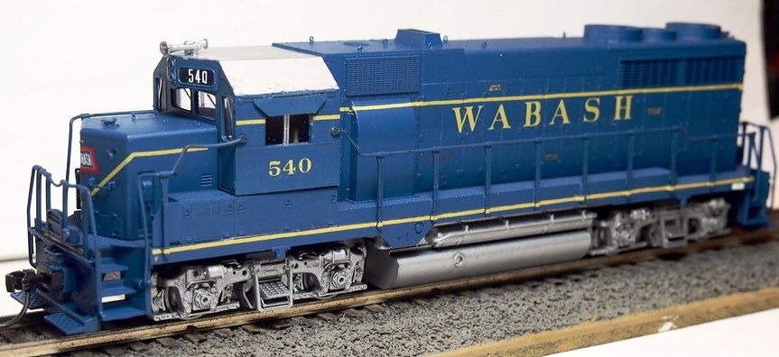
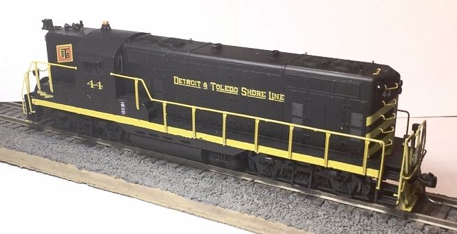
I Like the later pre-merger Wabash Units!  And the Detroit & Toledo Shoreline (Similar to the NKP)  Rick Jesionowski |
|
|
|
Post by Great-Northern-Willmar Div on Apr 9, 2020 9:25:35 GMT -8
Penn Central isn't real flashy. Kind of plain if you think about it.
|
|
|
|
Post by nsc39d8 on Apr 9, 2020 12:55:26 GMT -8
I don't think anyone has mentioned Norfolk & Western but just plain black with the NW on the side and cab numbers.
|
|
|
|
Post by csxt8400 on Apr 9, 2020 16:12:52 GMT -8
Huge fan of simple schemes. A bigger fan of them than most are.
A non-comprehensive list:
Penn Central
New York Central of the 60's (think new GP40's and U25B's)
Conrail Quality
CSX YN3
Norfolk & Western Blue
CGW GP30/SD40 late
GTW Orange and Blue
Illinois Central Deathstar
Soo Line Candy Apple red
KCS White
|
|
|
|
Post by Paul Cutler III on Apr 9, 2020 17:51:18 GMT -8
Other simple schemes:
NH: All Pullman Green bodies, black underframe, yellow road name and numbers (diesels and electrics).
B&M: All black with square B&M herald in white w/ white numbers.
B&A: All black with "Boston & Albany" in white w/ white numbers.
CNJ: All Pullman Green bodies, black underframe, yellow/gold herald and numbers.
DL&W: All Pullman Green bodies, black underframe, yellow/gold herald and numbers.
Seriously, how many all-black or all Pullman Green paint schemes were there?
|
|
|
|
Post by cf7 on Apr 10, 2020 3:19:08 GMT -8
DL&W: All Pullman Green bodies, black underframe, yellow/gold herald and numbers. I always thought the DL&W hood units were black. Learned something new today! |
|
|
|
Post by Paul Cutler III on Apr 10, 2020 7:30:14 GMT -8
cf7,
Here's the deal: I was photo searching Google when I swear I saw an diesel switcher marked "Lackawanna" and painted Pullman Green. Do you think I can find it? Of course not; only black engines show up now. Sigh.
Still, it's a pretty plain paint job.
|
|
|
|
Post by Colin 't Hart on Apr 10, 2020 8:05:18 GMT -8
cf7, Here's the deal: I was photo searching Google when I swear I saw an diesel switcher marked "Lackawanna" and painted Pullman Green. Do you think I can find it? Of course not; only black engines show up now. Sigh. Still, it's a pretty plain paint job. One like this?  |
|
|
|
Post by edwardsutorik on Apr 10, 2020 8:13:36 GMT -8
Remember, folks. We're discussing what we might be candidates for the BEST non-flashy paint scheme. Good luck with arguing that about the CNJ. To get back on track, I'm gonna throw this one in:  Interestingly, I might very well have seen this engine, back in '58. My mom used to regularly drive my brother and I through San Berdoo, going out to March Field. One day, lookin' sideways out the back window, I saw one of these, idling next to a citrus packing house (yes, Virginia. They really did used to grow oranges there). Those zebra stripes imprinted big on me. Got me one Santa Fe zebra stripe I bring out for special occasions. Plus some Santa Fe ice reefers. Ed |
|
|
|
Post by gevohogger on Apr 10, 2020 9:09:13 GMT -8
It's very business like, note the battery access door have been reversed on the short hood...  With the stripes? Those aren't battery doors of any kind. |
|
|
|
Post by TBird1958 on Apr 10, 2020 10:00:15 GMT -8
Ooop, you're right they're the sand box door covers, my bad!
|
|
|
|
Post by edwardsutorik on Apr 10, 2020 10:31:16 GMT -8
On my first tour of a diesel locomotive*, when I was about 4, the engineer pointed "there" and said that's where the sandbox was.
Yeah, right, pal.
You're a grown-up.
Grown-ups don't play in sandboxes. You shouldn't mislead kids like that.
But I caught him out.
Ed
*It was a switcher, Santa Fe maybe, that worked the giant Sears store and warehouse in LA.
|
|
|
|
Post by Great-Northern-Willmar Div on Apr 10, 2020 11:43:31 GMT -8
Norfolk & Western blue.
Spokane, Portland and Seattle broad band.
|
|
|
|
Post by thebessemerkid on Apr 12, 2020 2:08:36 GMT -8
I've always like the look of the Erie diesels. Black with the yellow winged diamond, super sharp. Black always seems to look good on a locomotive. I would also add the early Erie-Lackwanna black and yellow. The C-424s look all business...  That's a good lookin paint scheme. Other basic schemes that aged well: NP, Milw, B&LE, WM (black), B&O/C&O, PC, PRR, LV (well some of them were basic), SP, CN (black&red), all strictly business. |
|